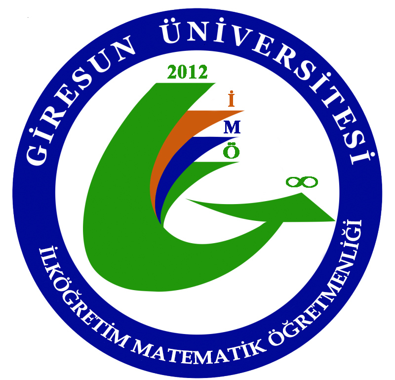
The Primary School Mathematics Teacher Training Program at Giresun University's Faculty of Education has built its corporate identity on a contemporary visual language that is highly representative and aligned with the university's holistic brand understanding. While the program uses Giresun University's main logo in official corporate communication, it also has a unique program logo reflecting the university's color palette for use in academic and social events.
The program logo consists of the letters "İMÖ," symbolizing the Primary School Mathematics Teacher Training program, and reflects Giresun University's corporate colors, symbolically representing multiculturalism, academic universality, and interdisciplinary interaction. The year 2012 in the logo represents the year the program began its educational activities, while the infinity symbol signifies that its educational activities are not limited to the Faculty of Education but continue throughout life. The colors in the logo form a meaningful whole with the program's core values:
Green represents sustainability, harmony with nature, and long-term academic development;
Blue represents universality, scientific reliability, and an internationalization vision;
Orange represents dynamism, creativity, and an innovative pedagogical approach;
White symbolizes openness, transparency, and academic integrity.
This symbolic structure visually reflects the program's commitment to both local values and its openness to a global understanding of education. This logo functions as a visual identity element that strengthens the program's recognition, particularly in posters, invitations, presentations, and digital content used in scientific events, student-focused organizations, workshops, and social responsibility projects.
The program's unit identity is built upon a consistent visual and linguistic narrative that supports its teacher training mission, innovative pedagogical approach, and internationalization vision. A professional, reliable, and academically serious approach is adopted in all printed and digital materials, adhering to the corporate color palette, typography principles, and logo usage guidelines.
To increase digital visibility and student engagement, the program regularly shares its events and academic activities through its website. This platform serves as a digital showcase reflecting the program's dynamic structure, student-participatory activities, and academic productivity; it also highlights the youthful, innovative, and interaction-oriented aspects of the program's identity.